Started developing imagery-
Here I was drawing circles (the sun) in many different ways. I felt like the work with line in visual language was really feeding into these explorations. Similarly to how I found I stuck to drawing in pencil at the beginning of the last project, I have been mostly using ink and brush in this project so far. I really liked the bold, stark images of the circles- all not quite perfect (which I liked- raw quality).
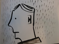
Also pushed some other more representational imagery- but perhaps less obvious than a black sun. First of these is a man walking in the rain- which is one of the first thoughts I had when thinking of imagery linked to depression/melancholia. Not quite sure why I visioned it as man in a suit but it was the boldest character I could think of.

 |
| Imagery |
 |
| Imagery |
Here I was drawing circles (the sun) in many different ways. I felt like the work with line in visual language was really feeding into these explorations. Similarly to how I found I stuck to drawing in pencil at the beginning of the last project, I have been mostly using ink and brush in this project so far. I really liked the bold, stark images of the circles- all not quite perfect (which I liked- raw quality).
Also pushed some other more representational imagery- but perhaps less obvious than a black sun. First of these is a man walking in the rain- which is one of the first thoughts I had when thinking of imagery linked to depression/melancholia. Not quite sure why I visioned it as man in a suit but it was the boldest character I could think of.
 |
| More Imagery |
 |
| More Imagery |
Quite liked the line work on these figures/characters but I just got the feeling they were a bit too lighthearted for the subject matter and style of writing in the book- I want SOME degree of reflection of the content on the cover. Maybe remember these characters for reusing in a future project. Also- the text is in paper cut out- really like cut outs and was inspired to revisit after Louise Lockheart lecture- but not sure its applicable to this project- again, too lighthearted- not the right tone of voice.
Third bit of imagery was wilting plants- again a classic bit of imagery related to melancholia. Once again- liked the line work with ink and brush with these ones- but I started thinking about composition a bit further- and that I had only really thought about front cover so far- so I tried stretching the image length ways across the panels- (vis a vis of Bob Dylan's Blonde on Blonde album cover)- not sure the image worked as a composition but it got me thinking, then...

Had a chat with Jamie and I realised that I needed to approach it as one design across 5 panels- not JUST a cover.
I had been thinking of how to fill the other 4 panels if I used the sun as a cover - so it went from one image to a whole jacket design. Talking to Jamie made me realise that blank space can be as important as used space- and being being bold is ok- even if that means really simple. -I HAD had the thought the circles were a bit of a cop out.
I think whatever I decide to push further after the rough stage I think I will use quite a formal, simple typeface- probably applied digitally.
I think whatever I decide to push further after the rough stage I think I will use quite a formal, simple typeface- probably applied digitally.
Jamie mentioned Richard Serra's drawings- rough circles-v. nice line work. Richard Serra's circles reminded me of the Japanese 'perfect circles' mentioned by Richard in the cop lecture a few weeks ago- may revisit that.
Jamie also mentioned trying to communicate it less literally- similar to drawing opposites in visual language- so I will do some word assoc- and develop imagery from that (next) (closed, trapped, heavy etc.)- so far I felt like I was finding it quite hard to express what I wanted to say in the right tone of voice for the content of the book-but maybe a less literal interpretation will help communicate this.
As I've been going along Kazimir Malevich popped into my head-in particular his black square- don't really know to describe it- seems like a v.pretentious painting but its a very melancholic, sad piece-heavy.
SO... next I need to push these ideas just a bit further- break through into another level- and then get the ideas into some more completed roughs.
No comments:
Post a Comment