 While doing the editorial project I remembered a book I found in college last year about Ghanian flags (Asafo! African Flags of the Fante, Thames and Hudson) (There are some really great illustrations of fishing).
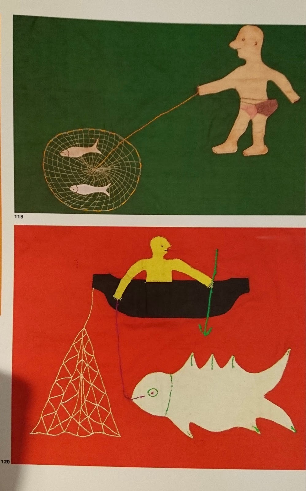
I got the book and the use of colour and simple shapes are incredible. Most images are reduced down to their most simple forms. Some images are quite abstract and surreal while others are very literal. Scale is played with a lot.

The simple shapes and bright colours mean the images are similar to paper cuts- I guess the fact they are cut out shapes appliqued onto textile means they are similar to cut paper.
The flags have such a fresh and different approach to image making- with very charming images even when they are depicting quite brutal things.
Again, I think the simplicity of these images are similar to the Picasso (post about it is on the studio practice blog) and Jay Cover work I have been looking at recently.
This post is also on PPP- still not quite sure what goes where- something I need to rectify.
No comments:
Post a Comment