 After deciding which rough to develop, I decided to get on photoshop- to get the type set out- which I would then work over in acrylic to get the final cover.
Having not really used photoshop before I was really happy with the outcome (and plus it was fairly painless and easy)- really liked type set out and was almost tempted to leave it at that- in reality I knew it had to have SOME degree of illustration- so that it at least slightly communicated something about the book (design vs function).
I decided to leave the spine white- mostly for practical reasons as it was the only way I could think to get the text on the spine in- and I didn't think it overall affected the look of the jacket.
I scanned in the texture to see if I could do the whole cover digitally- It looked really nice on screen- but I couldn't get the finish I wanted or darkness of the black through printing-looking now I wonder if I should have pursued this further/looked for solutions to these problems as I do really like the look of this cover.
 |
When it came to adding the paint/finishing touches I
tested a lot- doing multiple try-outs on templates
before doing the final. In all these tests I kept the
spine fairly clean- and the final it was fairly clean
-but I feel the nature of the design means any
blemishes are very noticeable- and that dedication
to no blems was something I find quite hard.
In the end I was happy with it-
but couldn't help but feeling I should try something
more simple that would compliment the type/setting
a bit more so... |
 |
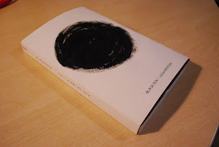
I thought I'd try my initial idea- of just a simple black circle
on the cover. I thought it was really striking- and liked it
-but again, I felt conflicted- it seems very simple- nothing
on the back- does it communicate as well as the other one?
Both designs have pros and negs. After thinking about
it I still don't know which of these two finals to submit
as my final final- but I'm fairly happy with both. |
Overall, I've enjoyed this brief- in the end it feels like quite a lot of graphic design- a fair amount of fine arty bs- maybe with a bit of illustration on the side. I've quite liked pushing the limits, but not being afraid to keep it very simple. Looking back now I wonder whether exploring more representational ideas further before diving into the conceptual stuff might have been as good idea?- or just more ideas/media exploration in general? I feel like these are things I always think at the end of a project.
 After deciding which rough to develop, I decided to get on photoshop- to get the type set out- which I would then work over in acrylic to get the final cover.


No comments:
Post a Comment