I thought the brief sounded very exciting and I am looking forward to getting stuck in. I chose the starting point weather.
My initial thoughts/up shoot from conversations were... (most viable ones in bold)
How weather is always about but most of the time you don't notice it (only when its very good/very bad.)
Weather is a go to conversation filler- if you are struggling to talk about weather talk about the weather.
Some people live in wild conditions due to the weather- Northern hemisphere where its really cold and dark almost 24hrs a day (darkness is not really weather is it?) They feel sad quite a lot and there are a lot of devil worshippers.
The people on st. Kilda in Scotland who evolved to have mad feet to climb cliffs and kill sea birds to eat.
All the people who live in deserts, houses that are adapted for hot places.
Some animals live in much more extreme places than people (Planet Earth 2)
Global warming is changing weather- what happens to the polar bears?
The shipping forecast
Weather affects peoples mood.
How does somewhere recover after it's been affected by extreme weather? (e.g. floods) Lots of Leeds was flooded a few years ago but you couldn't tell now.
Sun beds- artificial sun
Fake snow
People who deal with extreme weather in their hobbies- walkers, skiers, surfers, kite flyers.
Weather in different seasons. -is the weather what signals changing seasons?
Weathered surfaces.
Preserving things that are being weathered- old buildings and the coast line.
Hibernating animals, wild adaptions that animals have for their environments.
I think the two that stick in my head most are extreme weather (depending on how extreme/which extremes this might not be great for winter in Yorkshire) and 'normal' weather (which is probably quite hard to make seem interesting)
Maybe approach the social side of weather? or the physical affect of weather on landscape? so many scattered thoughts. Need to start researching to focus this down a bit.
I'm not really sure where to go on the trip- the seaside interested me- theres quite a different kind of weather by the sea, fishermen see some of the wildest weather; the moors (sees extreme types of weather) or just stay in Leeds (weather is always all around after all). Country side or seaside is probably most exciting for going for a stroll in- I think I just want to wander aimlessly/get lost, make some drawings collect some things etc.
In terms of the conversations I had a few thoughts- my grandma- older people love talking about the weather and my grandma is great at conversation. Also I have a relative on the Isle of Man who loves complaining about the wild weather, the island gets cut off when the weather is bad and the weather is quite often bad. Maybe they would be able to reflect on how weather has changed through their life/ weather at different times of their lives. Maybe I could talk to one of my friends who do geology about weathering/erosion- maybe a bit dry? maybe I need some dry conversation? I could just record every conversation I have about the weather for a week (lots of short recordings).
Wednesday, 30 November 2016
Tuesday, 29 November 2016
Visual Narratives - screen print/map
We were given a group brief to go on an adventure and make a 2 colour screen printed map from the results. I was quite excited by the brief but unsure about the fact it was group work (its normally a bit uncomfortable). Also, the day we went on the adventure was super rainy- which made it hard to adventure and keep feeling positive. I think all 3 of us felt a bit lost- didn't really have a plan/know what we were doing. Generally collected drawings/photos/ephemera as we went along.
When we were putting the poster together it felt like we had a lot of stuff but not much of it was really connected and none of us could really think a definite way to bring it together. It felt like it took quite a lot of effort but in the end, the making of the screens came together really quickly and I liked how they looked- felt like it had all come together spontaneously and I was really happy with how it had turned out.
 The actual screen print/induction was so good. I had not screen printed since the end of foundation and it gave me such joy to do it again. I was really happy with the prints and the fairly free approach to printing was so much fun- over printing, not properly registering etc. (kind of how I approached it at foundation).
 |
| crop of my fav. print- like how colours have been overlaid - nice shapes, good textures on the red. |
Monday, 28 November 2016
My dream house?
 |
| Vis lang task to make our dream house- taking from mark making task earlier on. Looking now it looks a bit over worked- and not simple enough. I don't feel like I thought outside the box enough. |
Shape- papercuts vol.1- simple=better
 |
| We were told to pick our favourite fruit and make paper cuts from it. The 3 above were my favourite. My first a single segment- with a mosaic thing for the flesh. It took too long and looked over complicated. After this I decided to go as simple as possible- channeling Enzo Mari- the result is the middle one-and there was also a negative space alternative (which I'm not as keen on). At the time the middle one seemed over simplified (I was wondering if it still looked like an orange) so I played around with composition and torn edges. It was very hard to get a smooth round edge with torn paper and I think the most simple comps were the most effective. The one on the left came about by returning to the first approach-but simplifying it - I quite like it but wonder if it could be simplified/refined more? done from a different perspective? One on the right came from seeing yellow paper and realising I'd only used orange. I think using the extra colour allowed me to simplify the forms. I quite like the results from playing around with lots of little bits- rather than big shapes but wonder whether they'd be better bigger- again- like the one on the left- different in some way- maybe in how the image is communicated. |
Shape- paper cuts vol.2- Me face
 |
| This followed on from the fruit- shape task. We had to produce a self portrait with shape. I decided to use a full composition and keep it as simple as possible. I wasn't sure about the ground- could have used something other than plain white paper. The shirt seems a bit busy (and out of scale- not just a bad photo) compared with the rest of the image- maybe more muted colours would have helped (or simplified patterns?) |
Thursday, 17 November 2016


Sunday, 13 November 2016
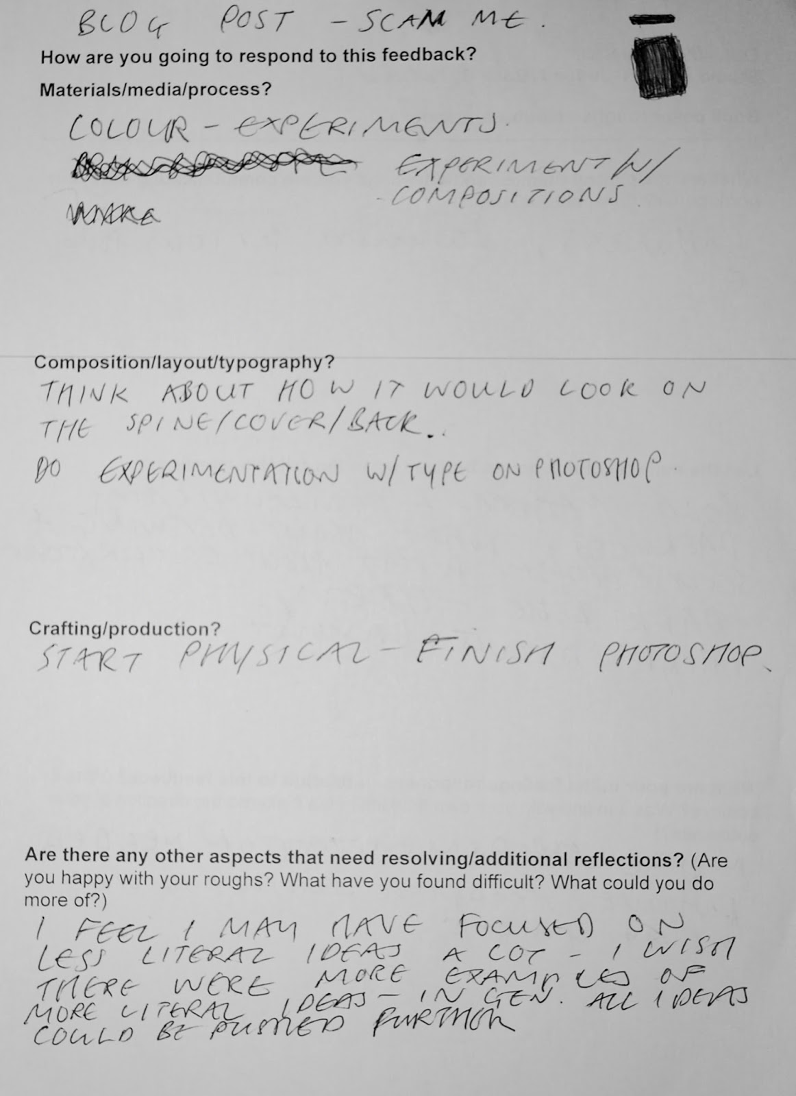
End of Module Evaluation
The start of this module was strange. It felt like it was the first time I had fulfilled briefs for a long time and getting back into it immediately was quite hard (probably also dazzled by so many welcomes/introductions). My difficulty getting back it straight away meant the first brief was fairly tough going- and felt like it I spent longer than it should have done. At the beginning the 2 week briefs seemed very hectic- I thought it was going to be really hard to keep up with. Now after the 3rd of these briefs my work load feels much more manageable- probably because I am more in the flow- I have more of a routine, I have settled into Leeds/the studio etc more. In retrospect, I am glad I had the shock of these very fast briefs as I feel it pushed me into action- and got me up and going faster than I would otherwise. At the beginning of the module I was kind of intimidadted by how good everyone else in the studio is (something I found at the beginning of foundation too) I feel like now I’ve got over it a bit now- which allows me to be more confident in my own work. The thing I’m probably happiest with is that this module has helped me to strike up quite good studio practice (partly through the shock of the early briefs), and I can feel the more time I spend in the studio the more my work improves.
I feel like I haven’t experimented very much in terms of media during this module- which is unusual for me. I have almost exclusively stuck to pencil, black ink and goache. Part of this may be not being inducted into print yet- as that is something I enjoy experimenting with (especially with different techniques). Even still, I think I could have made better of use of more techniques (such as paper cut) -sometimes when I think of experimentation I think it can end up as a box-ticking exercise-which it should not be. I think I might need think about my approach towards experimentation a bit more- while thinking about the actual experimentation less (being less constrained). After experimentation, I often found it hard to develop my work into well refined more final images- which is something I’m trying to improve on. At times, especially with the illumination brief I did work that I felt would benefit from being at least partly digital. As I am not very experienced/good at digital processes this is something I’d like to chip away at/improve so it is a tool I can use in future modules/briefs. Before starting the module, I hadn't done very much visual communication- being given set briefs to respond to (such as the illumination brief) I can feel even in this short module my problem solving in regards to this has improved.
I really did not like lots of my work at the beginning of this module (for example, the poster project- seemed very crude, unrefined, with bad ideas) but I think it has grown on me with time; and for the most part I have liked each thing I’ve done more than the last. In the editorial project I felt much happier with my approach; but now looking back I'm not so keen on two the outcomes (the two with albatrosses in)- I just feel like theres something missing that might have been worked out with further development (idea, media, composition or finish?). I am most satisfied with this final brief- which I think is a good sign. The work for this final brief feels pretty bold- and although I’m not sure I want all my work to have this approach, its nice to try out different approaches, being open to things etc. As I get more comfortable (in the studio environment, in Leeds, etc.) my work is becoming more confident- and hopefully refined.
So far I feel like my blog is ok- but I don’t use it as much as I could- and when I do, the posts are too long and rambling- not straight to the point enough. I do much more reflection than I record on my blog- and I think this is because it is not immediate- with a journal you can write it down immediately and then reflect later; with the blog, even when I make notes of these reflections I often forget to record them on my blog. I think in future, quicker notes about the work I have done (bullet points- whats good, whats bad) with a bigger focus reflecting on my processes. Throughout the module I collected artist reference and research- which was mostly posted on my PPP blog as the reference/research often had an influence on my work in a more general way. Often, especially at the beginning of the last two briefs I would think of references to research further and then would forget to research them, which is something I should change for the future.
Friday, 11 November 2016
Book cover #3- development and finals
 After deciding which rough to develop, I decided to get on photoshop- to get the type set out- which I would then work over in acrylic to get the final cover.
Having not really used photoshop before I was really happy with the outcome (and plus it was fairly painless and easy)- really liked type set out and was almost tempted to leave it at that- in reality I knew it had to have SOME degree of illustration- so that it at least slightly communicated something about the book (design vs function).
I decided to leave the spine white- mostly for practical reasons as it was the only way I could think to get the text on the spine in- and I didn't think it overall affected the look of the jacket.
 |
 |
| When it came to adding the paint/finishing touches I tested a lot- doing multiple try-outs on templates before doing the final. In all these tests I kept the spine fairly clean- and the final it was fairly clean -but I feel the nature of the design means any blemishes are very noticeable- and that dedication to no blems was something I find quite hard. In the end I was happy with it- but couldn't help but feeling I should try something more simple that would compliment the type/setting a bit more so... |
 |
| I thought I'd try my initial idea- of just a simple black circle on the cover. I thought it was really striking- and liked it -but again, I felt conflicted- it seems very simple- nothing on the back- does it communicate as well as the other one? Both designs have pros and negs. After thinking about it I still don't know which of these two finals to submit as my final final- but I'm fairly happy with both. |
Book cover mega update 2- roughs
After the last big blog post, I completed my roughs. I decided to mostly pursue the more conceptual ideas- with the plant and tree being more representational.
 My favourites were the all black except for white strip at bottom (came out of ways of communicating the meloncholia/depression non-representationally- weight, darkness) and the black circle (sun) spreading across the front and back covers. Thankfully, in the crit people mostly agreed with me that the strongest were the these two.
 I found it very hard to chose between the two- but after talking to Matt I decided I would push the black/white strip towards a final as it is less ambiguous to its message- while being less representational- even if it is less illustrative.


Wednesday, 9 November 2016
Photoshop Treatments


5 photoshop treatments of ink and brush drawings. I hadn't really used photoshop before. These results are from blundering around until things happen. The possibilities of photoshop are exciting. Top left/middle might be my favourites- Separating out the shapes show things I couldn't have seen before- characters etc..
Monday, 7 November 2016

Sunday, 6 November 2016
30 Drawings - investigating line quality
 Here is a selection from 30 drawings I did- continuing the investigation into line quality- except here I am exploring it through my theme of volcanoes, fossils etc.
  |
I quite like flat brush goache trilobite- I think it gets the general shape across with very simple line work.
 |
Most of the drawings were working from fossils. I think they lend themselves to lifework quite well- thinking of different ways to build up texture.
The pencil drawings where I didn't use unusual method were mostly my least favourite- too fast, too scribbly.


Generally, I felt I wasn't completing drawings- mostly just partial sketches- I'd get part way through and loose faith/get bored.
When I realised this I started doing larger, more general shapes- I also feel when I concentrate on detail the drawing as a whole often looks wrong- so drawing more general shapes helped with this.
I was still not entirely enjoying the subjects I was drawing- but doing the crit- and thinking of people who draw/paint landscapes gave me much better idea of ways I could approach it (ppp post to follow?).
Thursday, 3 November 2016
Book cover update
Been plodding along with the new project- I feel like I've made good progress the last few days.
Started developing imagery-
Here I was drawing circles (the sun) in many different ways. I felt like the work with line in visual language was really feeding into these explorations. Similarly to how I found I stuck to drawing in pencil at the beginning of the last project, I have been mostly using ink and brush in this project so far. I really liked the bold, stark images of the circles- all not quite perfect (which I liked- raw quality).
Also pushed some other more representational imagery- but perhaps less obvious than a black sun. First of these is a man walking in the rain- which is one of the first thoughts I had when thinking of imagery linked to depression/melancholia. Not quite sure why I visioned it as man in a suit but it was the boldest character I could think of.

 |
| Imagery |
 |
| Imagery |
Here I was drawing circles (the sun) in many different ways. I felt like the work with line in visual language was really feeding into these explorations. Similarly to how I found I stuck to drawing in pencil at the beginning of the last project, I have been mostly using ink and brush in this project so far. I really liked the bold, stark images of the circles- all not quite perfect (which I liked- raw quality).
Also pushed some other more representational imagery- but perhaps less obvious than a black sun. First of these is a man walking in the rain- which is one of the first thoughts I had when thinking of imagery linked to depression/melancholia. Not quite sure why I visioned it as man in a suit but it was the boldest character I could think of.
 |
| More Imagery |
 |
| More Imagery |
Quite liked the line work on these figures/characters but I just got the feeling they were a bit too lighthearted for the subject matter and style of writing in the book- I want SOME degree of reflection of the content on the cover. Maybe remember these characters for reusing in a future project. Also- the text is in paper cut out- really like cut outs and was inspired to revisit after Louise Lockheart lecture- but not sure its applicable to this project- again, too lighthearted- not the right tone of voice.
Third bit of imagery was wilting plants- again a classic bit of imagery related to melancholia. Once again- liked the line work with ink and brush with these ones- but I started thinking about composition a bit further- and that I had only really thought about front cover so far- so I tried stretching the image length ways across the panels- (vis a vis of Bob Dylan's Blonde on Blonde album cover)- not sure the image worked as a composition but it got me thinking, then...

Had a chat with Jamie and I realised that I needed to approach it as one design across 5 panels- not JUST a cover.
I had been thinking of how to fill the other 4 panels if I used the sun as a cover - so it went from one image to a whole jacket design. Talking to Jamie made me realise that blank space can be as important as used space- and being being bold is ok- even if that means really simple. -I HAD had the thought the circles were a bit of a cop out.
I think whatever I decide to push further after the rough stage I think I will use quite a formal, simple typeface- probably applied digitally.
I think whatever I decide to push further after the rough stage I think I will use quite a formal, simple typeface- probably applied digitally.
Jamie mentioned Richard Serra's drawings- rough circles-v. nice line work. Richard Serra's circles reminded me of the Japanese 'perfect circles' mentioned by Richard in the cop lecture a few weeks ago- may revisit that.
Jamie also mentioned trying to communicate it less literally- similar to drawing opposites in visual language- so I will do some word assoc- and develop imagery from that (next) (closed, trapped, heavy etc.)- so far I felt like I was finding it quite hard to express what I wanted to say in the right tone of voice for the content of the book-but maybe a less literal interpretation will help communicate this.
As I've been going along Kazimir Malevich popped into my head-in particular his black square- don't really know to describe it- seems like a v.pretentious painting but its a very melancholic, sad piece-heavy.
SO... next I need to push these ideas just a bit further- break through into another level- and then get the ideas into some more completed roughs.
Wednesday, 2 November 2016
Editorial -development and outcomes
Feels like I forgot to blog the second half of this project (oh no).
After drawing lots of albatrosses I did lots of quick ideas- as many as I could think of as fast as possible- churned out lots of pages. I tried not to judge the ideas before I got them down- and then reflected on them later. I also tried to think harder about certain ideas- so they were less superficial.

After talking with Jamie in my tutorial I decided which 3 roughs to do, 2 of which played on sayings alluded to and based around animals from the article:

-'Elephant in the room'- elephant squeezed into square frame
-Albatross feeding a chick assorted plastic- decided to do this one as the landscape one- fits best.
-Albatross hanging round the neck- I was thinking of using this as the landscape one I realised that the composition didn't quite work and I agreed with Jamie that it would work better as the portrait one.
The elephant (square) image already felt quite resolved- and just needed tweaking- which I did through testing in my sketchbook.
The landscape albatross image was more complicated but I had quite a solid idea of how the composition would work.


The portrait (albatross hanging around the neck) was the hardest- I agreed with Jamie that the 'hanging'- burden- needed to be communicated more subtlety than in the drafts (I had used a rope to connect the two).
I found this image the hardest- getting the balance between communicating the idea and being subtle was hard- but also compositionally. Only fairly late on in the project did I find out that the origin of the saying is from the poem 'Rime of the Ancient Mariner' after talking to my mum about the project. Coincidentally, the character I had been sketching had been a fisherman. I wish I had found out about the poem earlier as there are some really nice illustrations from the poem (Gustave Dore).

I thought the fisherman on this image would be better with a slightly different tone of blue (rather than black) outline. This also means the albatross silhouette stands out more- however now I feel I should have atlas experimented with different options with this.
I decided to stick to a fairly graphic style throughout after the elephant idea- so the images had a consistency- however now I feel I may have focused on that too soon- at the detriment of image making. I also tried to maintain a similar colour scheme- and mostly used goache throughout.


In the end, I was really happy with the way the elephant turned out- especially the line work- however it occurred to me that it may not fully communicate the article.
I was less happy with the albatross images. I think I mostly struggled with the backgrounds- wanting to keep the compositions simple so they worked at the scale. I was not happy with the dry brush effect in the end- I don't think it gave it the right finish. Most other backgrounds I tried didn't really work either- but I definitely should have experimented more (COLLAGE) also I got the feeling that the problem may have been easier to solve with photoshop. I think the dry brush added to my feeling that the two albatross images weren't quite 'crafted' enough- similar to the first vis skills brief- maybe I didn't spend enough time on the final images.
Overall, I enjoyed the brief but I felt I need to think more about problem solving- which may be down to being more reflective- probably more just recording my reflections as I go. (USING THE BLOG/NOTES AS I GO).
Tuesday, 1 November 2016
Asafo Flags- retrospectively blogging editorial research/musings?
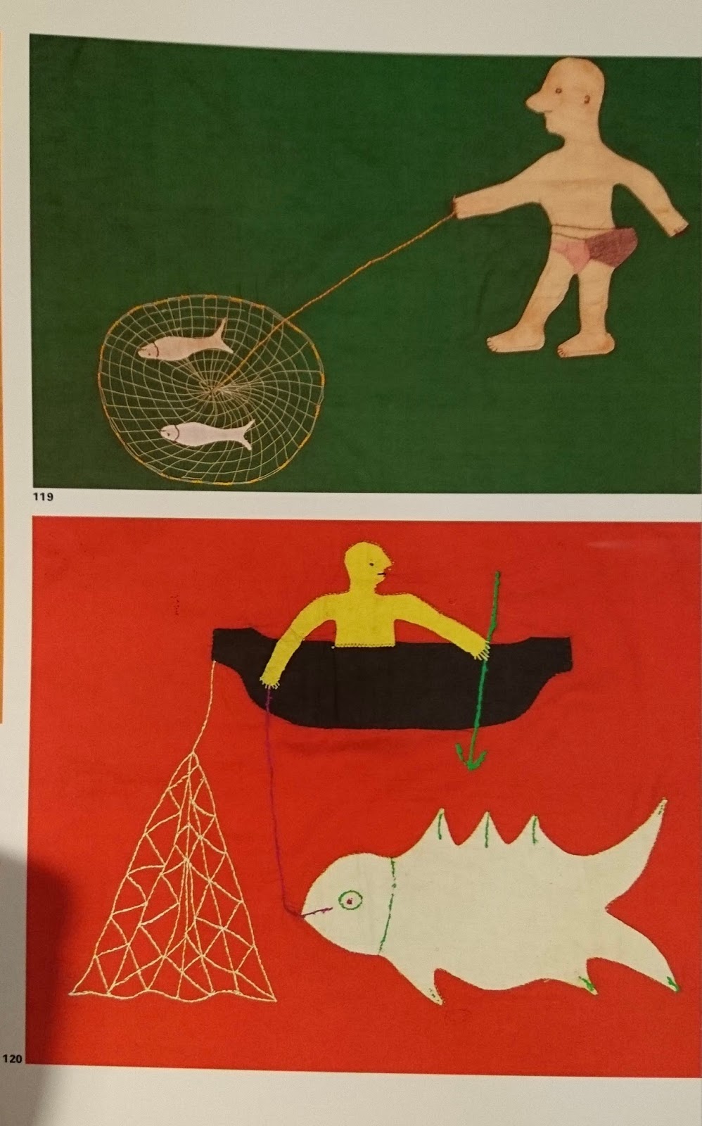 While doing the editorial project I remembered a book I found in college last year about Ghanian flags (Asafo! African Flags of the Fante, Thames and Hudson) (There are some really great illustrations of fishing).
I got the book and the use of colour and simple shapes are incredible. Most images are reduced down to their most simple forms. Some images are quite abstract and surreal while others are very literal. Scale is played with a lot.

The simple shapes and bright colours mean the images are similar to paper cuts- I guess the fact they are cut out shapes appliqued onto textile means they are similar to cut paper.
The flags have such a fresh and different approach to image making- with very charming images even when they are depicting quite brutal things.
Again, I think the simplicity of these images are similar to the Picasso (post about it is on the studio practice blog) and Jay Cover work I have been looking at recently.
This post is also on PPP- still not quite sure what goes where- something I need to rectify.
Visual Language- quality of line pt.2
These are the drawings (of people in the room) created from using a line qualities from tests. I did a lot of drawings and most of them were very fast- and I wasn't happy with them- like this first image.
 After a while I slowed down, and concentrated on the subjects a bit more- and this created the drawings I was more happy with. I did the drawing on the left first- although slower it was still lacking observation. The second (on the right) is better observed and I think the simplicity of the line is better.


Subscribe to:
Comments (Atom)