Wednesday, 29 March 2017

This module felt like return to the structure of visual skills, with quick briefs, a lot of learning but short briefs. This meant it was sometimes hard to push ideas very far and briefs required a fair amount of committing to an idea fairly early. 

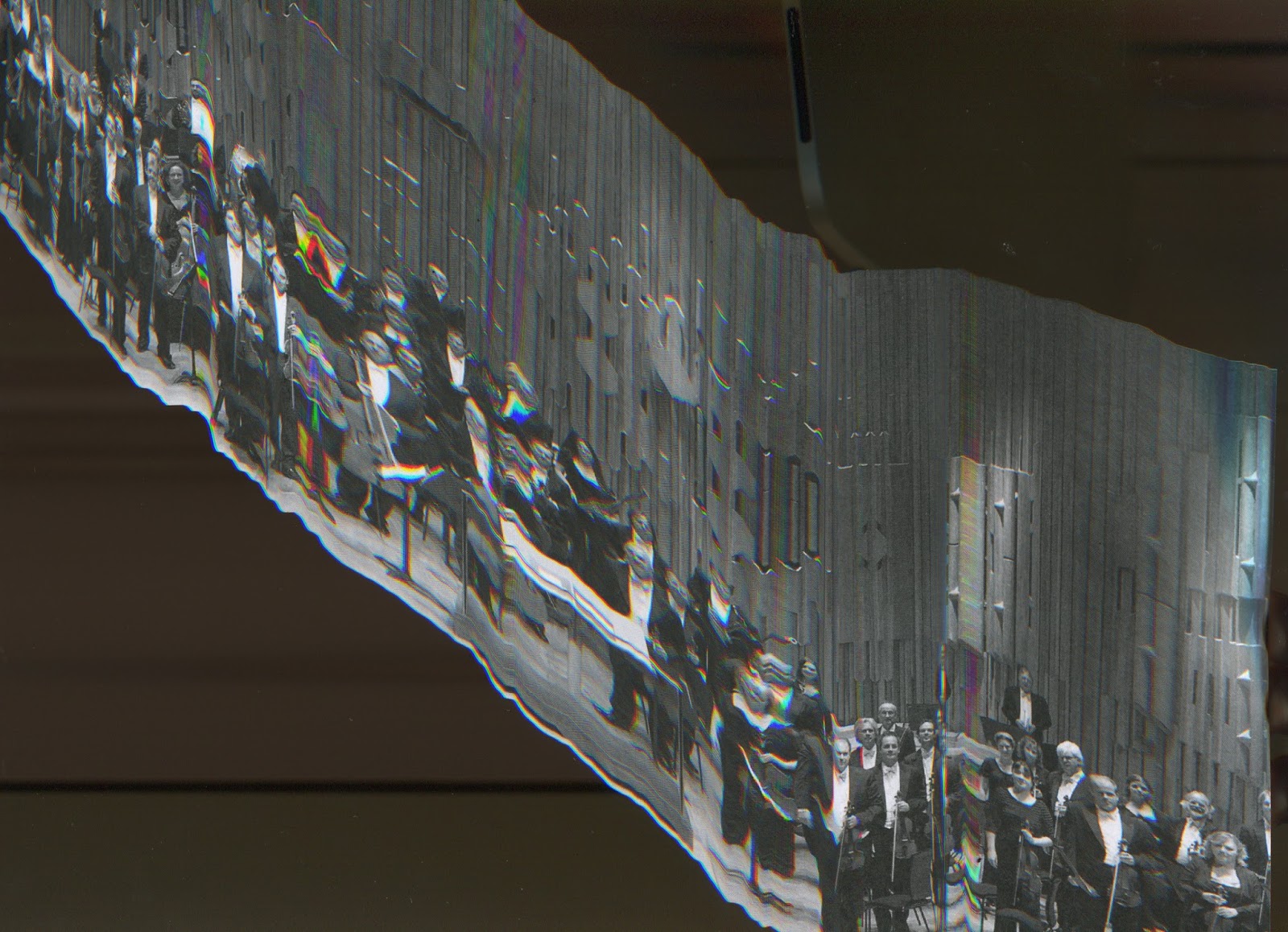
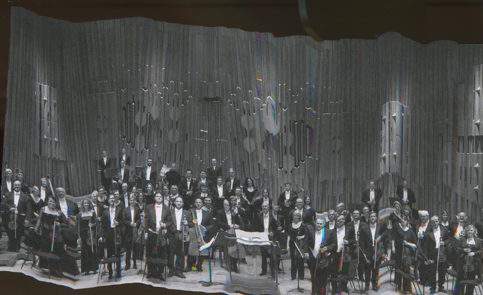
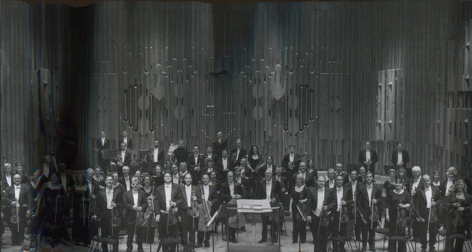
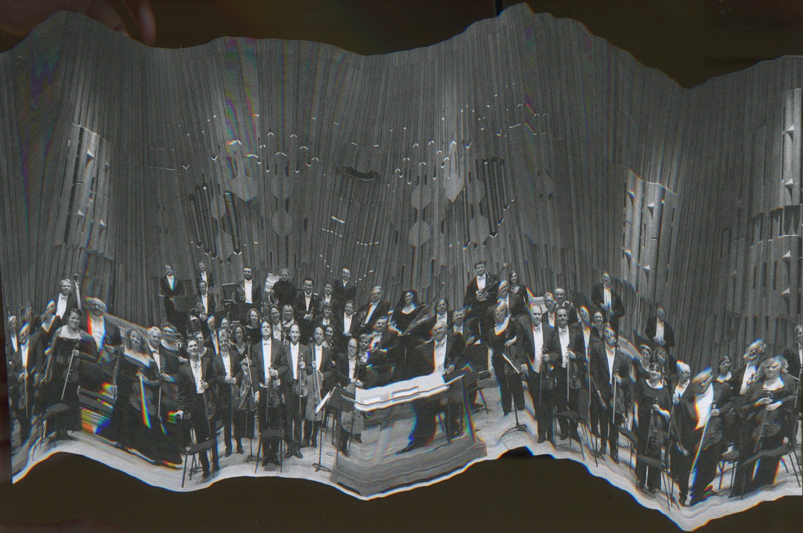
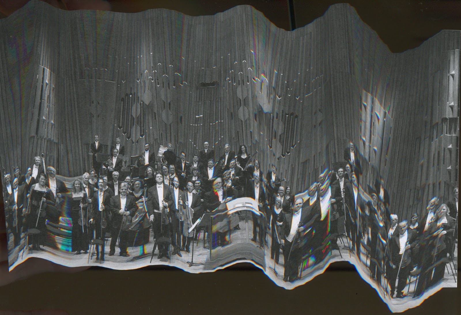
It was nice to learn new processes. I used glitching as a part of the final brief, which was really interesting as it feels technical, but is very easy and I also liked the random element of it. Digital processes have been pretty much new to me this year and I’ve tried hard to develop my skills and I definitely feel like they have developed. However, I found lots of the digital work (illustrator, making the gifs) quite hard as I still don’t feel that good at digital processes. Although it was time consuming, I enjoyed the gif making and I can imagine making more in the future. For the illustrator (sticker) brief, I picked a very simple design that didn’t require using curves. I tried out curves a bit but I don’t think I fully mastered it. While I was happy with my design, I realised that I hadn’t learnt as much about illustrator as if I had chosen a more complicated design (or pushed more than one outcome). The technological restrictions of brief 1 and 2 meant I don’t think I did as much experimenting and thinking about ideas and visuals, and as a result the outcomes felt more complete and successful. This module has opened me up to ways to make digital work interesting and not totally lifeless. 


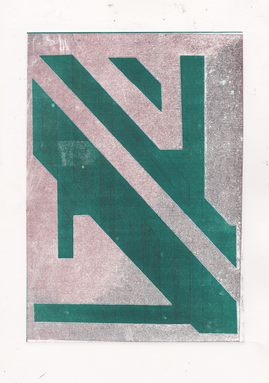
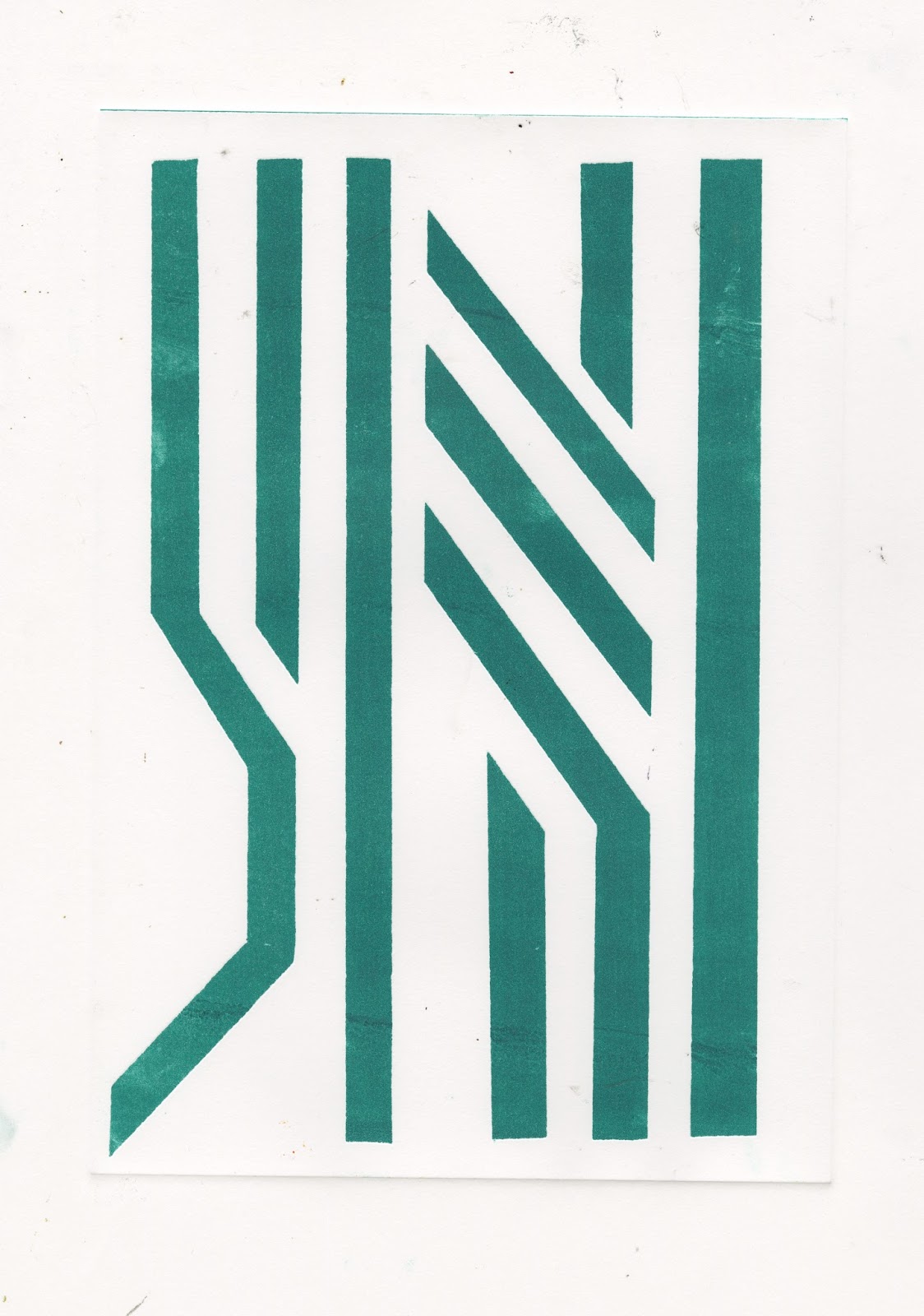
During this module; especially in the final brief, I’ve revisited processes I’ve used before and I enjoy, like mono printing and manipulating images with a scanner. It feels almost strange returning to these processes as I’ve been using so many different processes this year and I think I need to apply what I have learnt in new processes to processes I already know (not getting stuck in a comfort zone or doing the same thing over and over again).

It feels like I am becoming less preoccupied with what the work I’m making is (is it illustration) and letting it happen a bit more (for example, the final brief). This has positives and negatives, as the work could potentially be more interesting as I’m not ignoring potential ideas much; but maybe these ideas not as useful or refined. In this module and visual narratives I think I have been trying to find a way to focus the slightly more ridiculous elements of my image making to be more structured and useful as pieces of visual communication.

For the most part, I think I’ve maintained better studio practice for this module and as a result is that the workload has felt more manageable. My blogging also feels like it has improved, I’ve got a routine and I do it regularly. However, sometimes I wonder if my posts can be long rambling and nonsense for anyone except for me. 


In the final brief, I struggled with outcomes. I ended up pushing the development of the project rather than focusing hard on the outcomes. This may be down to the length of the brief combined with a tendency to developing through pushing image making and playing around rather than straight up designing. I think this can sometimes be a strength but it can impact on outcome, which is annoying. In future, I need to be more aware of where I am in a project and planning what to do next; in general, but more importantly on short briefs. (structure and planning).

Sunday, 26 March 2017

Person of Note: the Lost Blog Post

I forgot to post this when it happened last week - but here are some variations on the drawing machine from pushing it a little further - mostly some used 2 people holding onto wire connected to one pen. (Nous Vous) The outcomes were not that great - but as a process it was interesting. at the time I didn't see it fitting the project - and it wasn't quite as mechanical as I'd like. and so I didn't keep pushing it as I didn't feel like I wanted to dedicate a lot of time to developing a complicated drawing machine. On a longer project maybe I could have pushed this further.


Saturday, 25 March 2017

Completo


Got everything done (except the poster needs printing a2 for hand in). As I've said in previous posts, not really happy - doesn't feel like there is enough continuity across the 3 things. 

In the end I picked 4 of my mono prints for the stamps. The ones I picked seemed to have similar colours/vibes going throughout. The prints look like they could be abstract modules of a synth.

Postcards are glitches of the crude paintings. (did one more of Handel to make 3).

I think these are representative of the work I have made rather than saying quite what I wanted to about Wendy Carlos.

On a side not this is a screenshot of what I had when I finished messing around with photoshop etc. Its nice and glitchy.

End of Brief Angst

Struggling to pull the outcomes together for the persons of not project. I think the range of work I have made has made it quite hard - I want all the outcomes to have a continuity - but not all be exactly the same. 

The last week I have been spending a lot thinking about whether things are complete enough - whether they need an extra element - what that extra element would be? 

Are they similar enough - Does the simplicity of images combined with the continuity make them boring as a whole? Finishing one of the pictures and then trying to make another one fit with that vibe is hard. 8 different but similar things in such a short space of time is hard.

Do the pictures still communicate what I originally wanted to say? 

Do certain images lend themselves to certain scale? 

I have enjoyed process an playing around but I think it impacted my ability to pull outcomes together. 

I don't think people would know it was Wendy Carlos from the work I have made. 

Is this a time management problem or a problem with the way I have worked? 

Friday, 24 March 2017

Mono vol.2

I remembered what I was forgetting in the mono induction - circuit boards. Annoying as I didn't spend as long in the print room as I'd like and I've started doing this about a week too late. Like the outcomes but wish I'd done it sooner. Feel like this project could have about 2 more weeks and I'd feel like it was fulfilled. Could put several together to make a bigger composition. Pretty abstract but Maybe could have found a way to fit in with the glitches - adding to a comp. 


Who cares which way round they are

Thursday, 23 March 2017

Mono

Belatedly did my monoprint yesterday (missed the first oh no) I tried working with grids - for Wendy Carlos, synths, modules. Enjoyed it but don't really know how I feel - didn't come out as I expected. Maybe they are ok on their own - but maybe not as part of the persons of note brief.

Good to get back into it and it reminded me of the possibilities of mono as a way of doing prints fast and developing/pushing ideas/image making. 

Reminded me of photocopying - (bypass prints, manipulating etc.) another thing I used a fair amount on foundation as a way of helping image making on its way - should get back on that.


Type

Trying to add type - found the 3D type tool and like the effect it gives. Not sure it needs her name - but can't think what else to put to give a bit of context to the imagery. On the right is from a screen shot from setting the type. like the grid - but again not really sure. Need to get a shift on.

Wednesday, 22 March 2017

Grid instead of colour


Think the grid detracts from the images. Don't think they fully work. 

Pain-toing

 Last week I did these crude paintings. I finally scanned them in today and did a photoshop edit in the way the glitching worked. I find them funny and quite like them but I'm not sure where its going to fit into the wider project. - could they be the postcards? does this fit with the digital feel of the rest of the project. Glitching handmade - more with W.C. vibe?


Tuesday, 21 March 2017

Poster? Postcard? Will this do?

I've been trying to find a way to compile the glitches I've been making into a wider composition - possibly to make up the poster or a postcard. I don't know if they lose sight of Wendy Carlos and looks like a weird Mozart poster. 

Does it need type? will this help with the ambiguity? Then again I would consider using something silly - like wingdings or morse code - kinda glitchy (but wouldn't help with ambiguity). All the comps are kinda glitchy themselves. Tried scanning in ephemera to collage to make them seem less mozart-y. 

The bold colours feel to go with the digital glitchy vibe - (brown the colour of the wood of synths seems to look a bit dead) but not 100% on the backgrounds - textures? would textures be too complicated?. 

The negative space looks a bit like the circuit boards I had been making. Maybe could push this further. Is this good enough? feels like a cop out. 

Have I lost touch with the original starting point of the project? Also feel like these could be ok - they could be final? I think I need to have a bit of a think and rough a bit more

If I had more time I would like to make gifs out of these - more glitches. 


End of Module Evaluation


The spread out nature of this module meant that I never felt I got into depths of it and it was often overshadowed by the shorter modules (visual skills, visual narratives and visual communication. I don’t feel like I explored and spent enough time drawing and making work in the tasks in as much depth as I could have done. Often I would not spend as much time on tasks and reading around a task/idea as I could have done. I don’t think this gave me a big disadvantage but I might have been able to get more from certain tasks if I’d invested myself in them more.

For about the first half of the module, my blogging was fairly up to date. After around the Christmas break I got fairly behind. Annoyingly, this coincided with tasks that had a fairly large impact on my practice and therefore I didn’t record thoughts and reflections as well as I could have done. Throughout, my blogs have usually been shorter and more simple than other studio practice posts. This feels ok as I feel I have been blogging as it comes to me - rather than forcing myself to write more than I feel necessary for this module.

Some tasks really changed the way I look at work and informed the way I make work - in particular the composition, line of sight and frame. I found the way ideas were put forward and shown as rules you can adhere to (or subvert) really helped as a way of creating a structure around which to help make pictures. In the past I would judged and made pictures on I how I felt - the vibe I got; rather than thinking more in depth and considering as I would now. The structure maybe helps me feel less out of my depth when composing an image.

While I quite like some of the work I have made in this module it doesn't feel like there are many stand outs; and nothing feels very final. I feel more positive about this that I would in perhaps one of the shorter modules as I think the work has been useful as a way of learning rather than very ‘good’ (learning through making, process over outcome) for example, the screen print and compositions tasks - which are perhaps my two least favourite things I’ve done are the two that I think I’ve learnt most from. A couple of times in this module I would complete a task and not feel it was fully resolved and only in the crits would I see what I should have done. Maybe this was because I didn’t spend enough time on the tasks at the time. After I would plan to re-do the task before forgetting to - often because I had my mind on other modules and therefore I probably didn’t get as much as I could have done from the tasks.

The module has helped me see how other peoples practices work and how and why it informs the work they make. This in turn has made me think about my own practice and how it informs the work I make and how changing bits of my practice will impact the pictures I make. The module has also made me think much more about the tools different artists use to build up an image and the use of these tools impact on the communication of a piece. The work I have made in visual language has often informed and impacted on work in other modules.

Friday, 17 March 2017

Scanning games

Another thing that is addictive and I can't stop doing - scanning glitches. Done this before through photocopying. The more simple ones seem to work better. Again - like the other glitches - applying digital manipulation to an image of an orchestra. I think this  feels more physical, less digital than the code glitches - maybe this works better for Wendy's music - it has a mechanical side to it.


Probably my No.1
No.2?