Wednesday, 26 October 2016

Visual Language- Line quality and use of line

These are from a visual language last week investigating line quality (20 x 4 different approaches to line- circles, zig-zags, squares and lines)


The task made me think about different approaches to line- how you use the tool is as important a very important part of how you draw- which is something I need to explore more- how you apply pressure, speed, way you hold it etc.- which impacts how wiggly the line is, the weight of the line, and what movement it has.

Looking at the tests now- I think that I could have concentrated on these factors more than 'how I move my arm' side of drawing.

Strangely, I quite like the composition of some these tests- especially the line and zig-zag ones.


Monday, 24 October 2016

Visual Language- forgot about volcanoes.

I totally forgot to blog visual language- we got the brief ages ago- we got set themes to choose from- I was tempted by trees, flowers plants and leaves; sheds, treehouses and lodges, and American wrestlers. In the end I was thinking that I always seem to draw building and plants and wrestling sounded pretty narrow so I went for volcanoes, mountains and geology. 

Got a book out of the library called 'The earth on fire'- it has really bold and striking images of mountains and volcanoes.


 Drawing so many mountains and volcanoes has been surprisingly good and I actually like how the drawings have turned out (!?). However, it gets pretty repetitive after a while- I think I need to maybe work less figuratively and find some other resources- the college library is pretty thin on the ground on geology books- but I will hit up the city library- also a few of my friends from home do geology/I did it at A-level so I need to get on that.


 Most of these drawings seem more considered and accurate than most of my work so far. There is still some looser, less figurative stuff. Simple technical pen line work is nice and simple-finding the main shapes. As I said before though- feel like I need to switch up my drawing/focus for my next work on this


Saturday, 22 October 2016

Illumination intro pt.2

Build?
Forgot to blog this at the time- as part of the intro to illumination we were given a word and had to communicate it visually- I was given the word 'Build' I approached it both literally and non-literally. Only when you do something like this do you realise how hard it can be to communicate something lots of different ways without words- and that in this case too many vague images can confuse the whole thing. Interesting to see how different people interpret the images/their meaning. As I am blogging this I am getting stuck for ideas for the roughs and looking back at this is helping refresh my memory- looking at different ways of communicating.

Albatrosses are nice

Only just remembered to blog this but had a good time watching albatrosses while I was working the illumination project other day- kinda getting obsessed with albatrosses and songs titled albatross. Videos helped with drawing from reference- also got a book about endangered birds from the library. Maybe need to tone the albatross appreciation down a bit. Also the commentary on the last video is pretty funny.


Friday, 21 October 2016

Brief 2- Illumination

Initial thoughts on project

The article I got is about environmental issues- global warming and extinction mostly. The article is very passionate. Explores how consumerism desensitises people- people are maybe unaware of what goes on. The article has lots of facts and stats. While the article is very serious and deals with serious issues it makes clear at the end that change is possible- slightly positive end. Initial imagery I thought of were from phrases based on animals mentioned in the text- albatross around our neck- elephant in the room- maybe too simplistic/obvious? starting by thinking and drawing from reference. Don't want final images to be too gory- off putting from article- but still bold- striking. Once again need to blog when I make notes- get into a routine- and not later- like here.

Monday, 17 October 2016

OUIL403 - Typology Poster

After getting the ideas once I started trying to translate them into more fully formed drawings I found it pretty hard. I drew out imagery repeatedly until I was happy with it, which meant a lot of drawing. I wasn't happy with lots of my drawings. Just before I started the poster, I had a test with goache- and found that it gave some of the effect I liked from the really thick pencil (blobby?) while also works with ink. The way I had developed the pictures (the best ones were bold & simple) I decided worked best with minimal tone- mostly block grey. I also found planning layout quite hard- I tried planning on A4 but just couldn't visualise it- and work out things would fit together; so I did a full scale plan. Throughout the execution of the final poster I felt like I should have spent more time planning layout and design of the actual poster- I didn't spend so much time planning layout as I was doing lots of testing in sketchbook. In the end I thought the work was ok- but I wasn't overly keen on it.

On a side note I realise that I need to do more blogging as it happens- not looking back- maybe need to keep a journal and regurgitate in on here- a little bit, more often.

Tuesday, 11 October 2016

Typology Poster- So far

 So far I am enjoying this project, being playful with ideas and drawing is good fun. 

So far I have lots of the drawing and composition elements fairly vague- now I need to start clear this up and tie up loose ends. So far I mostly throwing ideas around and now these ideas need to be applied. I'm still entirely sure about which materials to use- I like the effect of the thick pencil I have used on some of the drawings- while others probably would work better with ink, and others with pen. I am aiming for some running themes/styles throughout so I'll probably reduce the numbers of drawing styles and and find a compromise with materials. 

As well as the composition the drawing needs developing. Lots of the ideas I thought of are quite complicated and the drawings I have done so far are not self explanatory. While I feel the text adds to some of the humour I'm not sure how it will work visually. The text kind of ties in with the composition/layout issues- and I feel like the only way to sort this is to do lots of tests and layouts. 

Tuesday, 4 October 2016

Observational Drawing

This is one of the first pages from the location observational drawing. Similar to work throughout, its mostly fairly loose, small sketches. The majority of the drawings were of buildings- but these first ones are more plants, people etc. 
I wasn't happy with most of the drawings as I felt they were too loose (too many drawings didn't look like anything) and lacked observation (things weren't where they should be). This made me realise that I need to do much more drawing from life.

Over the weekend, I did some more observational drawing. The best ones I did were drawing building from my window. These felt more concentrated- however looking now maybe they are too tight. 

Being told to draw from reference was strange- after being told never to draw from life at A-level and never to draw from photos at foundation. I enjoyed the exercise of looking, remembering and drawing. It surprised me how bad a) my looking is, b) my memory is and c) my drawing is. I think I could do a better job with my left hand than the first drawing- although maybe it does have some strange charm. 

Repeatedly looking, remembering and drawing the same image was good as I could tell I was improving. In the end you are focused into the main elements. The early drawings were very small and by the end they were bigger- scale also helped the drawing more than I expected.
Getting the photo and drawing straight from reference wasn't as helpful as I thought as I ended up putting too much detail in- and looking at specific details rather than the overall shape or form.
After comparing all of the drawings I realised I needed to get back to the focus on the main elements- mostly line with some shading- because of this my last drawing was also my favourite. 

Drawing from plants- I started out feeling like I needed to put much more detail than usual after trying to look and remember so much during the reference task- the drawings ended up not looking right and too overworked. With the brush and ink, drawing plants my natural reaction was to do fairly gestural line drawings. Of the two approaches the line drawing was definitely my favourite- with the my favourite results, I also liked the negative space drawing.


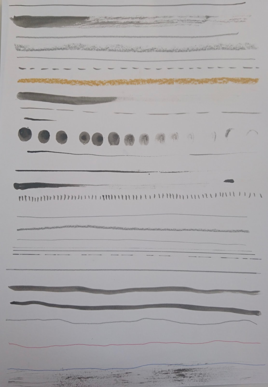
Other approaches around the studio were pretty interesting. This top one I especially liked because of the approach to mark making- specifically on the top left. Line work on the others, with some simplified was also really good.
 This one I really like the line drawings- both the ones with very fine lines- and where line width is varied. This variation gives a really nice feel for the shape of the plant. All the drawings are both interesting and refined- which is pretty good.
 Of these the bottom left stand out most- I like the way the different tones of ink have been layered- which gives a good impression of how the plant is- in three dimensions. All of the drawing have elements of this but the bottom left works best.


The observational drawing over the last few weeks has made me realise how out of practice I am at drawing- also I can see how it helps in all ways of image-making- the looking and thinking involved especially. Drawing from life gives a real idea of how things fit together in three dimensions-this does take a lot of looking and thinking but is v. helpful when you work it out. Drawing from reference again was strange- but it makes lots of sense, especially when you are trying to draw something that is hard to find everyday- it can be easier than drawing from life as you don't have to look and think quite so much. Both of these are things I need to do much more often