https://www.youtube.com/watch?v=_zWjT59S_wk
https://www.youtube.com/watch?v=fNVTREKKlgs
https://www.youtube.com/watch?v=cl4pJwcE7JI&t=177s
Saturday, 23 December 2017
Wednesday, 20 December 2017
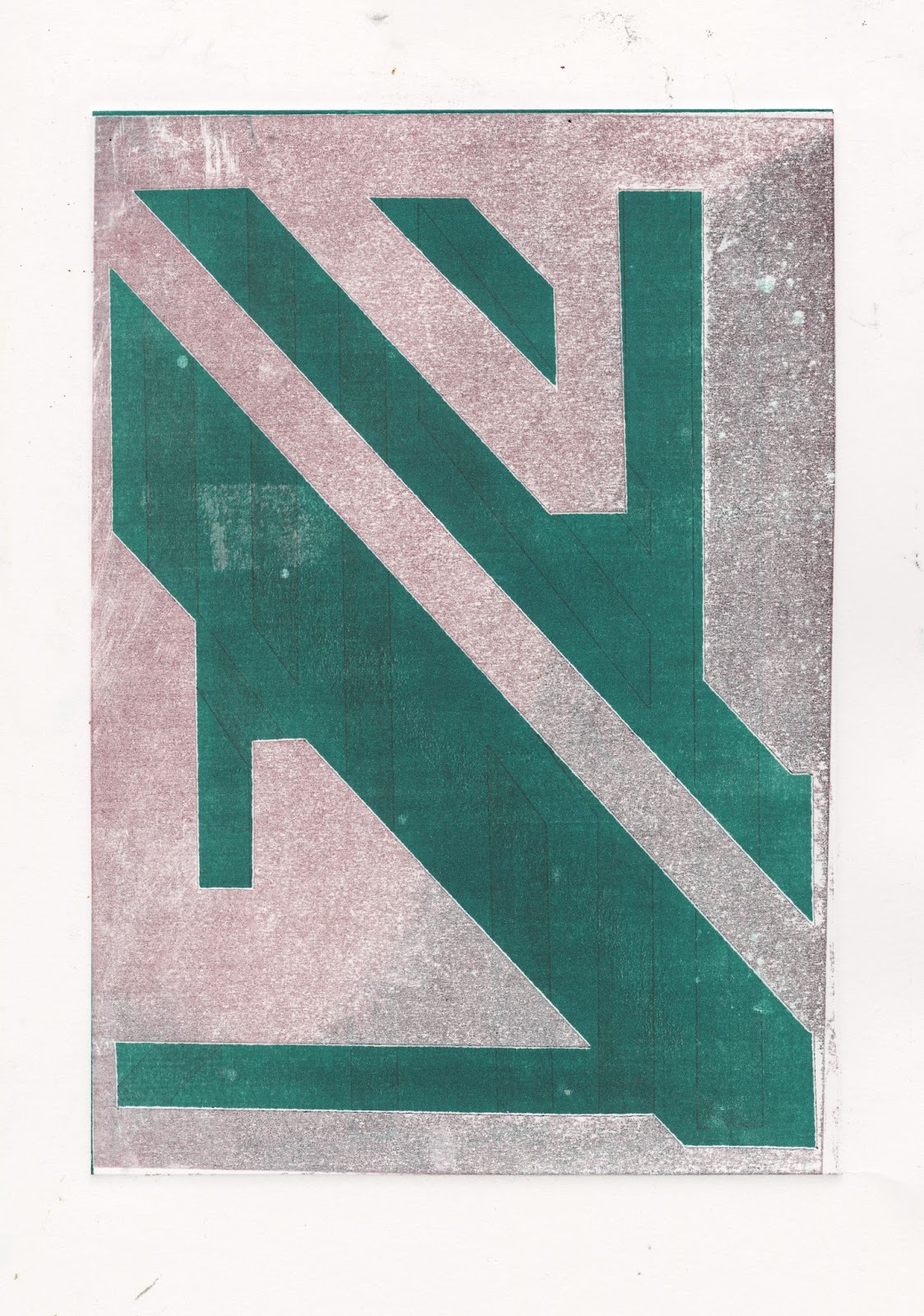
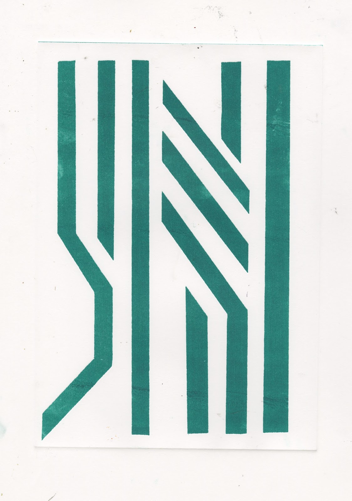
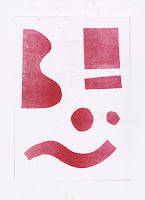
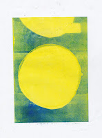
Studio Brief 3: Contemporary Print
Atelier Bingo

 DR. ME


Kate Gibb


All three of these illustrators use collage in their print making processes (either produced with screen print or risograph). I like that all 3 of these have a slightly experimental approach with often limited colour. Its nice to see how Kate Gibb and DR.ME use printmaking as a side to their more commercial practice - but it possible to see how the printmaking feeds into the commercial work
Study Task 2: Editorial
Saul Steinberg
Minimal, graphic - simple - inventive. Uses visual metaphor extensively. Also just has a very nice approach to drawing (Line quality etc)
Chen Winner
Nice colours, Interesting use of shade - dark and light. minimal colours overlayed - creating more colours. While I think some are a bit twee - some have more to them.
Dominic Kesterton
Graphic, sharp illustrations. Editorial illustration only makes a small part of his practice. Use of gifs (new york times) is interesting.


Friday, 17 November 2017
Peoples Hist Museo
These are a selection of photos from my visit to the People's History Museum in Manchester. (pretty bad photos - I'll blame bad lighting). Graphically I think the political posters appeal to me more (left on slide 3, left slide 5). I think I need adjust my approach to this project as I'm feeling quite stuck. The posters along with elements of the banners and maybe a bit of punky lo-fi production might be the approach. Reading 'Road to Wigan Pier' mentions slums in Leeds and Sheffield etc. Think most were in Quarry Hill and were cleared but there are some back to back houses a few streets away from mine now. There are gaps in the rows where I guess houses have been demolished. Going to take photos of these. Getting more elements but still feeling a bit spread out and not 100% where its going. Currently got a few books about textiles (one about clothes with propaganda on and one about trade union banners as well as one about punk publication - not textiles) I think this is the kind of 3 targets I'm going for. I know what I want but I can't visualise it.
Friday, 10 November 2017
Update
A few weeks of not doing very much. Found it hard to find inspiration, blast through. I had an idea of trade union banners based on Orwell. I still like this idea but I think I focused on it too much and didn't allow myself to play enough. Still finding idea generation hard. Want to work with collage (ephemera) but finding it hard to find certain imagery without using the internet (looking in books, magazines, charity shops). Another thing I put up to make things harder for myself but don't feel it would be as authentic with just googled images. Started doing some collagey things. Distracting myself from my idea for the 5 prints. Been reading short stories and essays By Orwell. These are useful as it gives a better idea of him and his precise views (and events that shaped these) also find it easier to absorb shorter stories. Next - need more collages, more playing. Maybe some more print (outside of workshops) (mono).
 |
| Scrint |
 |
| Lint |
Tuesday, 17 October 2017
Studio Brief 1: Idea Pictures
For this project I wanted to work entirely handmade (not digital) and set myself the target of having clearer communication of ideas. One of the set of finals were produced though photocopying. I found that the colour photocopier doesn't produce as interesting quality images as the black and white (the two degrade the image in different ways). I think this approach; while teaching me how to work an idea through fully through analogue processes also taught me how useful digital processes are; and with more time (especially on the miners and factory ones) I think these could have been much stronger. After finishing I thought I'd just give it a go digitally. This was fairly simple of just scanning in the components, adjusting levels and arranging them. I think the square and landscape work better this way. I think the landscape one lacks something - maybe detail on the figures, more general detail. I also think I cleaned it up too much - and it looks too digital
I felt the first two ideas came quite easily - and I was happy with them (mine shaft and factory). For a long while I didn't know what to do for the third. I did some drawings of miners that I liked (and was considering for the mine - but thought it would be too detailed). Ben said these could be used for the landscape - I agreed - goes with themes of unions, fraternity etc. and almost says as much as the other two. I think the fact that I had to work harder on the miner (landscape) composition means that in the end I think its better; in contrast, I think I didn’t push the factory (square) idea as far as the concept came to me fairly fully formed, so therefore I didn’t concentrate on the composition further than the image itself.
The thumbnail process was good; I feel like I usually push idea creation quite far, but the target of 60 meant I pushed it further than I normally would - and therefore created more interesting ideas than I otherwise would have.
I didn't feel like I had a good enough understanding and I was into the project and George Orwell himself at this stage to do the kind of work I wanted to (more abstract, less obvious) and therefore it feels quite different to the kind of work I usually make; which is not necessarily not a bad thing.


Tuesday, 3 October 2017
Studio Brief 1: Zine
I enjoyed the brief as a way to get ideas out and get the ball rolling without the pressure of making a finely crafted ‘final’. I decided to go for a fairly rough and ready approach (which sits my way of working)- especially using photocopying and collage (two things I wished I had used more last year). Mostly I was drawing off imagery from reading ‘Homage to Catalonia’. I felt that some of the images didn’t really have any meaning (just playing with collage and assemblage). This emphasised that it is impossible to communicate if ideas and themes aren’t clarified in my own mind. Also I think it could have been improved by being entirely photocopied.
Tuesday, 19 September 2017
Metamorphosis
Finished metamorphosis. I liked it quite a lot - especially the darkness of it. Its something I can see a fair amount of visuals in. I don't feel like it is enough material to do a project about - I don't have a deeper understanding of Kafka's work more broadly and although I think I'm going to read some more of his short stories I feel like there is more potential in George Orwell.
As someone who often struggles reading I think George Orwell is just a bit easier to read and understand. I have been in the darkroom today - will go back again. I would like to have some of the photos I took with and eye to retouching/collaging printed soon - so I get working on this project in a bigger way - however, at the moment I'm trying to print a series of photos I took on the Isle of Man at the beginning of the summer.
As someone who often struggles reading I think George Orwell is just a bit easier to read and understand. I have been in the darkroom today - will go back again. I would like to have some of the photos I took with and eye to retouching/collaging printed soon - so I get working on this project in a bigger way - however, at the moment I'm trying to print a series of photos I took on the Isle of Man at the beginning of the summer.
Thursday, 31 August 2017
Orwell etc.
As I was going to Spain on holiday, I decide to read Homage to Catalonia. I have now finished it. I got on with it quite well - fairly easy to read and I saw a reasonable amount of scope for visuals. While I was there I shot a roll of B&W film with the idea of going into the darkroom - scope for collage etc..
Having been trying to read Naked Lunch (not reading the chapters in order - when I started reading it in order it seemed like it made as much sense as if I wasn't) and finding it harder than Waiting for Godot (but with more scope for visuals) I wanted to like Burroughs as I thought it might fit quite well with my general approach but I'm not sure I get along with the text enough.
I'm erring on the side of George Orwell but I'm not fully sure how I feel about the books I am focusing on are written by him (a member of the aristocracy) living like a worker, homeless person and a fighter in the Spanish civil war (it feels like he is indulging in voyeurism) then again the way these books drew attention to working practices - the plight of people abandoned by politicians is interesting - and still very relevant today (one of my thoughts was I could visit these places now). Catalonia is campaigning to become independent, amount of homeless people in major European cities seems to be increasing, people are left behind/big poverty in parts of the north of England.
I've also knocked off Metamorphosis (the other Kafka I tried to start didn't set my world on fire) I am finding it quite interesting - but I'm finding that it feels like he is trying to get at something that I can't quite tell (all I can get is the senses of anxiety and sadness).
I also recently bought Susan Sontag on Photography - she is also on the list but I don't think this book will be of any use for this project.
To Kill a Mockingbird is another on my to read list - but I didn't fancy doing an author who had written so few books.
Wednesday, 9 August 2017
Update and About the author vol.2 (Talking to Godot, Kafka)
Finished 2 books in the last week - Ways of Seeing (John Berger) and Talking to Godot. I'm going to do some wider research for Samuel Beckett and maybe try thinking about some visuals jut to get the ball rolling - but I didn't feel like I got on with Waiting to Godot massively so I'm going to read research some more.
The next author in my sights is Kafka; I'm starting with a collection of short stories (Wedding Preparations in the Country - starting small) and if I get into I've also got the Castle, the Trail and America. Its dawned on me that I've spent a long time and not really got as much done as I maybe should of. I wanted to read some work before researching the authors - hoping to draw at least some of my own conclusions - but I'm beginning to think in the interests of time I might need to speed this up.
The next author in my sights is Kafka; I'm starting with a collection of short stories (Wedding Preparations in the Country - starting small) and if I get into I've also got the Castle, the Trail and America. Its dawned on me that I've spent a long time and not really got as much done as I maybe should of. I wanted to read some work before researching the authors - hoping to draw at least some of my own conclusions - but I'm beginning to think in the interests of time I might need to speed this up.
Tuesday, 1 August 2017
Waiting for Godot
I've started Waiting For Godot (Sam Beckett) for about the author. I liked the sound of a long, fairly meaningless story where nothing happens (of course with deep subtexts about the human condition). I have found most of the language quite impenetrable and a long session of reading it left me with a headache. Will finish reading it but I don't think Sam is my guy.
Thursday, 22 June 2017
About the Author
I'm someone who reads a lot but I was planning to do some reading this summer anyway so the authors I have picked are ones that I wanted to read some of anyway. I ideally want to try and read some of their work before researching them at all- but this might be a bit hard as I don't normally do much reading.
After having a look at the authors the 4 I'm going to look into in more detail are:
Franz Kafka
-He asked for all his unpublished work to be destroyed after he died (but it wasn't) - could do something ONLY focusing on work published during his life - or ONLY work published after he died - OR all the work that he destroyed (missing)
-Much of his work is quite surreal
-Believed that his style of writing references anxieties
-Died young (in his 40s)
William Burrows
-His big thing is cut-ups (easily transferred to visuals) could be used as a starting point (set a scene)
-He was in with the beat poets (bohemian, lots of drugs and drinking)
Going to give Naked Lunch a go
-He was in with the beat poets (bohemian, lots of drugs and drinking)
Going to give Naked Lunch a go
Samuel Beckett
-Existentialist play writer
-His writing is often has dark humour
Going to give Talking to Godot a go as a start
George Orwell
-Political (left wing)
-Big for 1984 and Animal Farm - both commentary on the impact of the state, dictators etc..
-1984 is the furthest I've got into a book before - when I was younger. I'm interested in reading books written from his experiences (non-fiction) - Road to Wigan Pier, Homage to Catalonia and Down and Out in Paris and London.
Wednesday, 29 March 2017
This module felt like return to the structure of visual skills, with quick briefs, a lot of learning but short briefs. This meant it was sometimes hard to push ideas very far and briefs required a fair amount of committing to an idea fairly early.
It was nice to learn new processes. I used glitching as a part of the final brief, which was really interesting as it feels technical, but is very easy and I also liked the random element of it. Digital processes have been pretty much new to me this year and I’ve tried hard to develop my skills and I definitely feel like they have developed. However, I found lots of the digital work (illustrator, making the gifs) quite hard as I still don’t feel that good at digital processes. Although it was time consuming, I enjoyed the gif making and I can imagine making more in the future. For the illustrator (sticker) brief, I picked a very simple design that didn’t require using curves. I tried out curves a bit but I don’t think I fully mastered it. While I was happy with my design, I realised that I hadn’t learnt as much about illustrator as if I had chosen a more complicated design (or pushed more than one outcome). The technological restrictions of brief 1 and 2 meant I don’t think I did as much experimenting and thinking about ideas and visuals, and as a result the outcomes felt more complete and successful. This module has opened me up to ways to make digital work interesting and not totally lifeless.
During this module; especially in the final brief, I’ve revisited processes I’ve used before and I enjoy, like mono printing and manipulating images with a scanner. It feels almost strange returning to these processes as I’ve been using so many different processes this year and I think I need to apply what I have learnt in new processes to processes I already know (not getting stuck in a comfort zone or doing the same thing over and over again).
It feels like I am becoming less preoccupied with what the work I’m making is (is it illustration) and letting it happen a bit more (for example, the final brief). This has positives and negatives, as the work could potentially be more interesting as I’m not ignoring potential ideas much; but maybe these ideas not as useful or refined. In this module and visual narratives I think I have been trying to find a way to focus the slightly more ridiculous elements of my image making to be more structured and useful as pieces of visual communication.
For the most part, I think I’ve maintained better studio practice for this module and as a result is that the workload has felt more manageable. My blogging also feels like it has improved, I’ve got a routine and I do it regularly. However, sometimes I wonder if my posts can be long rambling and nonsense for anyone except for me.
In the final brief, I struggled with outcomes. I ended up pushing the development of the project rather than focusing hard on the outcomes. This may be down to the length of the brief combined with a tendency to developing through pushing image making and playing around rather than straight up designing. I think this can sometimes be a strength but it can impact on outcome, which is annoying. In future, I need to be more aware of where I am in a project and planning what to do next; in general, but more importantly on short briefs. (structure and planning).
Sunday, 26 March 2017
Person of Note: the Lost Blog Post


Saturday, 25 March 2017
Completo


In the end I picked 4 of my mono prints for the stamps. The ones I picked seemed to have similar colours/vibes going throughout. The prints look like they could be abstract modules of a synth.
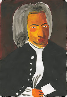
Postcards are glitches of the crude paintings. (did one more of Handel to make 3).
I think these are representative of the work I have made rather than saying quite what I wanted to about Wendy Carlos.
On a side not this is a screenshot of what I had when I finished messing around with photoshop etc. Its nice and glitchy.

End of Brief Angst
Struggling to pull the outcomes together for the persons of not project. I think the range of work I have made has made it quite hard - I want all the outcomes to have a continuity - but not all be exactly the same.
The last week I have been spending a lot thinking about whether things are complete enough - whether they need an extra element - what that extra element would be?
Are they similar enough - Does the simplicity of images combined with the continuity make them boring as a whole? Finishing one of the pictures and then trying to make another one fit with that vibe is hard. 8 different but similar things in such a short space of time is hard.
Do the pictures still communicate what I originally wanted to say?
Do certain images lend themselves to certain scale?
I have enjoyed process an playing around but I think it impacted my ability to pull outcomes together.
I don't think people would know it was Wendy Carlos from the work I have made.
Is this a time management problem or a problem with the way I have worked?
Friday, 24 March 2017
Mono vol.2
I remembered what I was forgetting in the mono induction - circuit boards. Annoying as I didn't spend as long in the print room as I'd like and I've started doing this about a week too late. Like the outcomes but wish I'd done it sooner. Feel like this project could have about 2 more weeks and I'd feel like it was fulfilled. Could put several together to make a bigger composition. Pretty abstract but Maybe could have found a way to fit in with the glitches - adding to a comp.


 |
| Who cares which way round they are |
Thursday, 23 March 2017
Mono
Belatedly did my monoprint yesterday (missed the first oh no) I tried working with grids - for Wendy Carlos, synths, modules. Enjoyed it but don't really know how I feel - didn't come out as I expected. Maybe they are ok on their own - but maybe not as part of the persons of note brief.
Good to get back into it and it reminded me of the possibilities of mono as a way of doing prints fast and developing/pushing ideas/image making.
Reminded me of photocopying - (bypass prints, manipulating etc.) another thing I used a fair amount on foundation as a way of helping image making on its way - should get back on that.


Type

 Trying to add type - found the 3D type tool and like the effect it gives. Not sure it needs her name - but can't think what else to put to give a bit of context to the imagery. On the right is from a screen shot from setting the type. like the grid - but again not really sure. Need to get a shift on.
Wednesday, 22 March 2017


Pain-toing
Last week I did these crude paintings. I finally scanned them in today and did a photoshop edit in the way the glitching worked. I find them funny and quite like them but I'm not sure where its going to fit into the wider project. - could they be the postcards? does this fit with the digital feel of the rest of the project. Glitching handmade - more with W.C. vibe?


Tuesday, 21 March 2017
Poster? Postcard? Will this do?
I've been trying to find a way to compile the glitches I've been making into a wider composition - possibly to make up the poster or a postcard. I don't know if they lose sight of Wendy Carlos and looks like a weird Mozart poster.
Does it need type? will this help with the ambiguity? Then again I would consider using something silly - like wingdings or morse code - kinda glitchy (but wouldn't help with ambiguity). All the comps are kinda glitchy themselves. Tried scanning in ephemera to collage to make them seem less mozart-y.
The bold colours feel to go with the digital glitchy vibe - (brown the colour of the wood of synths seems to look a bit dead) but not 100% on the backgrounds - textures? would textures be too complicated?.
The negative space looks a bit like the circuit boards I had been making. Maybe could push this further. Is this good enough? feels like a cop out.
Have I lost touch with the original starting point of the project? Also feel like these could be ok - they could be final? I think I need to have a bit of a think and rough a bit more
If I had more time I would like to make gifs out of these - more glitches.


End of Module Evaluation
The spread out nature of this module meant that I never felt I got into
depths of it and it was often overshadowed by the shorter modules (visual
skills, visual narratives and visual communication. I don’t feel like I
explored and spent enough time drawing and making work in the tasks in as much
depth as I could have done. Often I would not spend as much time on tasks and
reading around a task/idea as I could have done. I don’t think this gave me a
big disadvantage but I might have been able to get more from certain tasks if
I’d invested myself in them more.
For about the first half of the module, my blogging was fairly up
to date. After around the Christmas break I got fairly behind. Annoyingly, this
coincided with tasks that had a fairly large impact on my practice and
therefore I didn’t record thoughts and reflections as well as I could have
done. Throughout, my blogs have usually been shorter and more simple than other
studio practice posts. This feels ok as I feel I have been blogging as it comes
to me - rather than forcing myself to write more than I feel necessary for this
module.
Some tasks really changed the way I look at work and informed the
way I make work - in particular the composition, line of sight and frame. I
found the way ideas were put forward and shown as rules you can adhere to (or
subvert) really helped as a way of creating a structure around which to help
make pictures. In the past I would judged and made pictures on I how I felt -
the vibe I got; rather than thinking more in depth and considering as I would
now. The structure maybe helps me feel less out of my depth when composing an
image.
While I quite like some of the work I have made in this module it
doesn't feel like there are many stand outs; and nothing feels very final. I
feel more positive about this that I would in perhaps one of the shorter
modules as I think the work has been useful as a way of learning rather than
very ‘good’ (learning through making, process over outcome) for example, the
screen print and compositions tasks - which are perhaps my two least favourite
things I’ve done are the two that I think I’ve learnt most from. A couple of
times in this module I would complete a task and not feel it was fully resolved
and only in the crits would I see what I should have done. Maybe this was
because I didn’t spend enough time on the tasks at the time. After I would plan
to re-do the task before forgetting to - often because I had my mind on other
modules and therefore I probably didn’t get as much as I could have done from
the tasks.
Subscribe to:
Comments (Atom)